

 Importance of Typography
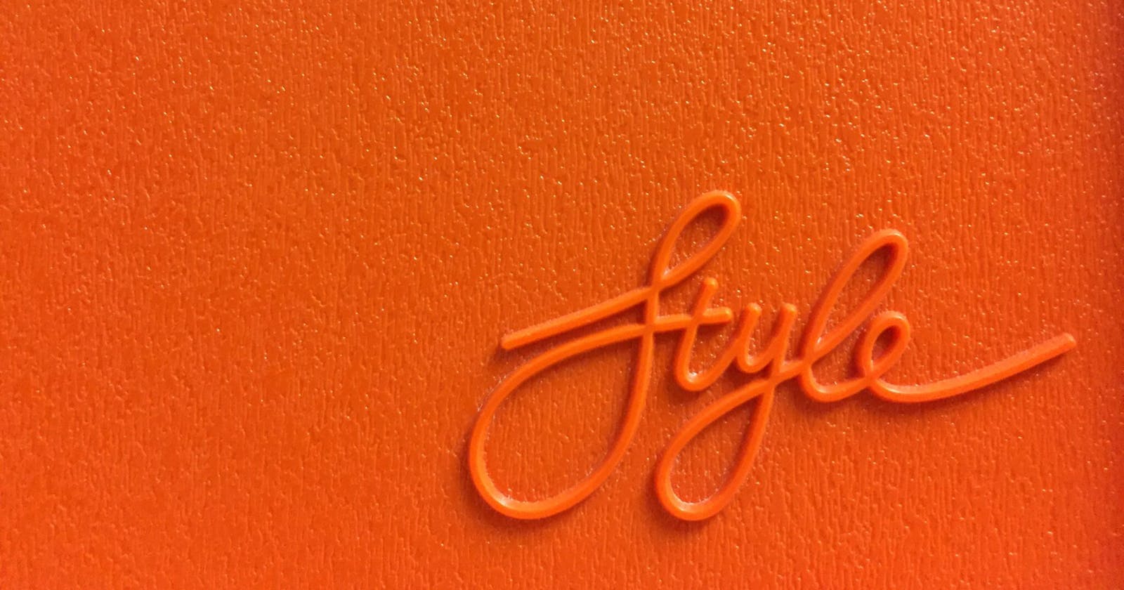
# Good typography is more than just the words and letters you choose. It’s about using the best fonts for your design, choosing the most appropriate font size, and being sure that your copy is easy to read.
# Typography makes a design easier to read, and can be the difference between an effective design and one that turns people away. Typography is used to organize information and present it in an appealing way. This can be anything from the size of a font to the use of bold and italics. Effective typography can make good content look great, whereas bad typography can make bad content appear even worse.
# Typography is an art form that is often overlooked by designers, but it is a vital part of a design. Typography can be a distraction or a focal point. Good typography is a balance of the right typeface, the right size, and the right spacing. The stock typefaces that are included with your computer are not very good, so it’s worth investing in a couple of quality typefaces. When you do, be sure to follow the principles of good typography.
# The first principle of good typography is to choose a size that is appropriate for the message. If your message is complicated and needs to be read carefully, a smaller typeface might be appropriate. If you want to get a lot of information across to your audience, choose a larger typeface.
# The second principle of good typography is to use the typeface in the most appropriate way. It is worth noting that a typeface is a collection of several typefaces. Most typefaces contain serif and sans serif fonts, as well as fonts in different weights and widths.
The third principle to remember is that you should never use more typefaces than you need.
What About the Web? # In the print world, the rules of typography are usually very strict. You should always use a sans serif font for body copy and a serif font for headings. In the web world, nothing is off-limits. Digital text is fluid. It adapts to the screen. The type is broken up into words and sentences based on the user’s screen size. So, is it mobile? Or tablet? Or both? Or neither? We have to decide.
# The typeface I’m using is called Proxima Nova, and I like it a lot. It’s simple and easy to read. But Proxima Nova is an extremely popular typeface, and I’m sure that someone out there is using it for the same purpose as me. To avoid any legal issues, the trademark owner could sue me for using its trademarked font. If I copy to a computer and then print copies of my newsletter, I’m also exposed to potential liability. So I have to be careful.
# There’s a way to avoid both issues. If the content is created by the person who paid for the service, then it’s not considered a third party. For example, if I create a newsletter and then print it out on my printer, I don’t need to count each page. Also, if I hire a professional editor to edit my book, then I don’t have to count the edits per page. Since I paid the editor, he’s not a third party.